Last year I discussed the basis of the AR4 attribution statement:
Most of the observed increase in global average temperatures since the mid-20th century is very likely due to the observed increase in anthropogenic greenhouse gas concentrations.
In the new AR5 SPM (pdf), there is an analogous statement:
It is extremely likely that more than half of the observed increase in global average surface temperature from 1951 to 2010 was caused by the anthropogenic increase in greenhouse gas concentrations and other anthropogenic forcings together. The best estimate of the human-induced contribution to warming is similar to the observed warming over this period.
This includes differences in the likelihood statement, drivers and a new statement on the most likely amount of anthropogenic warming.
It is useful to remind ourselves that these statements are addressing our confidence in the characterisation of the anthropogenic contribution to the global surface temperature trend since the middle of the 20th Century. This contribution is unavoidably represented by a distribution of values because of the uncertainties associated with forcings, responses and internal variability. The AR4 statement confined itself to quantifying the probability that the greenhouse-gas driven trend was less than half the total trend as being less than 10% (or alternately, that at least 90% of the distribution was above 50% based on the IPCC definition of “very likely”):
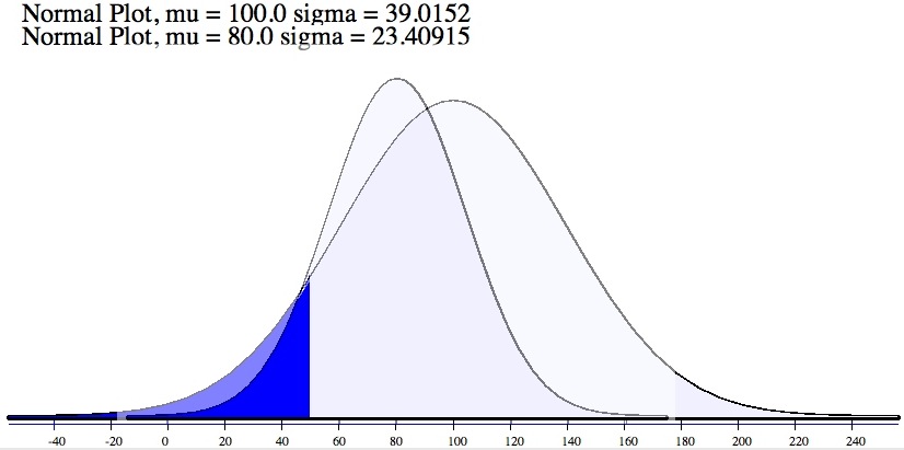
Figure 1: Two schematic distributions of possible ‘anthropogenic contributions’ to the warming over the last 50 years. Note that in each case, despite a difference in the mean and variance, the probability of being below 50, is exactly 0.1 (i.e. a 10% likelihood).
In AR5, there are two notable changes to this. First, the likelihood level is now at least 95%, and so the assessment is for less than 5% probability of the trend being less than half of the observed trend. Secondly, they have switched from the ‘anthropogenic greenhouse gas” driven trend, to the total anthropogenic trend. As I discussed last time, the GHG trend is almost certainly larger than the net anthropogenic trend because of the high likelihood that anthropogenic aerosols have been a net cooling over that time. Both changes lead to a stronger statement than in AR4. One change in language is neutral; moving from “most” to “more than half”, but this was presumably to simply clarify the definition.
The second part of the AR5 statement is interesting as well. In the AR4 SPM, IPCC did not give a ‘best estimate’ for the anthropogenic contribution (though again many people were confused on this point). This time they have characterised the best estimate as being close to the observed estimate – i.e. that the anthropogenic trend is around 100% of the observed trend, implying that the best estimates of net natural forcings and internal variability are close to zero. This is equivalent to placing the peak in the distribution in the above figure near 100%.
The basis for these changes is explored in Chapter 10 on detection and attribution and is summarised in the following figure (10.5):
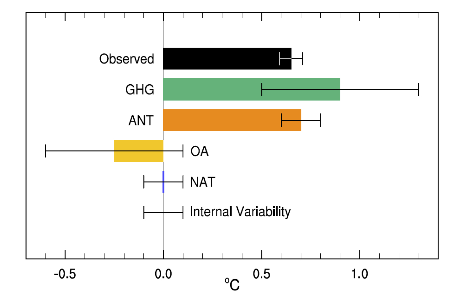
Figure 2. Assessed likely ranges (whiskers) and their mid-points (bars) for attributable warming trends over the 1951–2010 period due to well-mixed greenhouse gases (GHG), other anthropogenic forings (OA), natural forcings (NAT), combined anthropogenic forcings (ANT), and internal variability. The HadCRUT4 observations are shown in black with the 5–95% uncertainty range due to observational uncertainty.
These estimates are the “assessed” trends that come out of fingerprint studies of the temperature changes and account for potential mis-estimates (over or under) of internal variability, sensitivity etc. in the models (and potentially the forcings). The raw material are the model hindcasts of the historical period – using all forcings, just the natural ones, just the anthropogenic ones and various variations on that theme.
The error bars cover the ‘likely’ range (33-66%), so are close to being ±1 standard deviation (except for the observations (5-95%), which is closer to ±2 standard deviations). It is easy enough to see that the ‘ANT’ row (the combination from all anthropogenic forcings) is around 0.7 ± 0.1ºC, and the OBS are 0.65 ± 0.06ºC. If you work that through (assuming normal distributions for the uncertainties), it implies that the probability of the ANT trend being less than half the OBS trend is less than 0.02% – much less than the stated 5% level. The difference is that the less confident statement also takes into account structural uncertainties about the methodology, models and data. Similarly, the best estimate of the ratio of ANT to OBS has a 2 sd range between 0.8 and 1.4 (peak at 1.08). Consistent with this are the rows for natural forcing and internal variability – neither are significantly different to zero in the mean, and the uncertainties are too small for them to explain the observed trend with any confidence. Note that the ANT vs. NAT comparison is independent of the GHG or OA comparisons; the error bars for ANT do not derive from combining the GHG and OA results.
It is worth asking what the higher confidence/lower error bars are associated with. First, the longer time period (an extra 5 years) makes the trends clearer relative to the noise, multiple methodologies have been used which get the same result, and fingerprints have been better constrained by the greater use of spatial information. Small effects may also arise from better characterisations of the uncertainties in the observations (i.e. in moving from HadCRUT3 toHadCRUT4). Because of the similarity of patterns related to aerosols and greenhouse gases, there is more uncertainty in doing the separate attributions rather than looking at anthropogenic forcings collectively. Interestingly, the attribution of most of the trend to GHGs alone would still remain very likely (as in AR4); I estimate a roughly 7% probability that it would account for less than half the OBS trend. A factor that might be relevant (though I would need to confirm this) is that more CMIP5 simulations from a wider range of models were available for the NAT/ANT comparison than previously in CMIP3/4.
It could be argued that since recent trends have fallen slightly below the multi-model ensemble mean, this should imply that our uncertainty has massively increased and hence the confidence statement should be weaker than stated. However this doesn’t really follow. Over-estimates of model sensitivity would be accounted for in the methodology (via a scaling factor of less than one), and indeed, a small over-estimate (by about 10%) is already factored in. Mis-specification of post-2000 forcings (underestimated volcanoes, Chinese aerosols or overestimated solar), or indeed, uncertainties in all forcings in the earlier period, leads to reduced confidence in attribution in the fingerprint studies, and an lower estimate of the anthropogenic contribution. Finally, if the issue is related simply to an random realisation of El Niño/La Niña phases or other sources of internal variability, this simply feeds into the ‘Internal variability’ assessment. Thus the effects of recent years are already embedded within the calculation, and will have led to a reduced confidencecompared to a situation where things lined up more. Using this as an additional factor to change the confidence rating again would be double counting.
There is more information on this process in the IPCC chapter itself, and in the referenced literature (particularly Ribes and Terray (2013), Jones et al (2013) and Gillet et al (2013)). There is also a summary of relevant recent papers at SkepticalScience.
Bottom line? These statements are both comprehensible and traceable back to the literature and the data. While they are conclusive, they are not a dramatic departure from basic conclusions of AR4 and subsequent literature – but then, that is exactly what one should expect.
Nenhum comentário:
Postar um comentário